zaterdag 17 oktober 2009

The case of identical colors coming out way different

I bought 3 SW paint pots. I have painted them on white paper and they are 100% true to the color swatches and look great. I did a quick swipe with a paint brush on the old wall at my home (which has an off white color on it currently). The colors are coming out WAY different. My SW Sea Salt color is going from green to periwinkle blue and my amazing gray is going to purple brown. These are not just close changes, I am talking it looks like I chose to paint my room purple. I have spent countless hours picking out these samples to be this disapointed is unbelievable. I don't know what to do.
Colorman says:
I see two possible issues here:
1: The current color affects the new layer of paint. This can be solved by painting a second layer.
2: But more likely this is a case of metamerism. 
Meta what?
Metamerism means that colors perceived in a certain light will appear exactly the same to our eyes. But under another source of light, say an electric bulb, they will come out different. So if you change the light, two colors that first looked the same, may now appear different.
There's not that much you can do about metamerism. It's just a fact of life. However, you can deal with it by always evaluate your color under the same sort of lighting that you'll eventually use. Also, if you want to copy a certain color in your house in paint, most modern paintshops will be able to take metamerism into account. So if you take a sample of the color to the paintshop and have it measured there, metamerism shouldn't be an issue.

donderdag 15 oktober 2009

Moevenpick Hotel


So the hotel was ready. Then some manager suggested that the logo should be visable on the facade. '"Make it huge", he said, "we want everyone to see it."
"Which color? The color of the logo, obviously."
Duh...

woensdag 14 oktober 2009

Green Kitchen


I've selected paints for every room in my new (old) house...except the kitchen. I've been putting off making a decision, but I'm just about out of time. My husband really thinks we should just paint the kitchen white (Monterey White or Navajo White), at least for now, while we have to live with the bright green counters and dark appliances. Help?
Colorman says:
I tried playing with the window frames, but it doesn't work. This might do the trick. But it could be lighter too. Click on the picture to see the color and change it if you like.


dinsdag 13 oktober 2009

I hate blue, how about you?

This is totally off the wall and honestly, I've only had one glass of wine tonight, but it's occured to me that I have no blue in my house. I know blue is a very popular color and I see blue rooms all the time that I think are beautiful, but it's just not a color I think of when decorating. I was just wondering if you have an aversion to a particular color, especially the primary ones. 
Colorman says:
I have no colors that I particularly like. Nor are there colors that I hate. Having such predilections would be a tad difficult in my line of work. But frankly, I only consider color combinations, never a color on its own. I do have a personal preference for bold, complementary combinations. But I am able to keep that under wraps, if needed.

maandag 12 oktober 2009

Red Kitchen

I've been waffling on whether to paint our kitchen a deep red. We have medium brown oak cabinets, window and sliding door trim, cream colored countertops and almond appliances. Do you have a red that you really liked? Also, will this make our kitchen look too dated?
Colorman says:
One color is no color. As a result the 'red you really liked' means nothing. It depends on the individual and the setting. If you choose a red, it should be YOUR red for YOUR kitchen.

zondag 11 oktober 2009

Don't let this space intimidate you


Here are some pics of our living room. Please offer any suggestion on what we should do with all the wall space above the TV. This is very frustrating for us. Please Help!!!


Colorman says:
This is a great space. Don't let it intimidate you. Live with it. Breath it. Accept it. Show it.
The high wall needs a bold statement. Bold color. Or perhaps an XL work of art.
The space above the TV isn't awkward. The TV is. It's such a shame to fill that space with a TV. I'd hang the TV lower. Or find another place for it.
I colorjived your picture. Click on it to apply other colors.

zaterdag 10 oktober 2009

Dark Ceiling Can Make Space

On Rate My Space they are always painting the ceilings of every make-over they do. Why is that? Does it make the room look larger?
Colorman says:

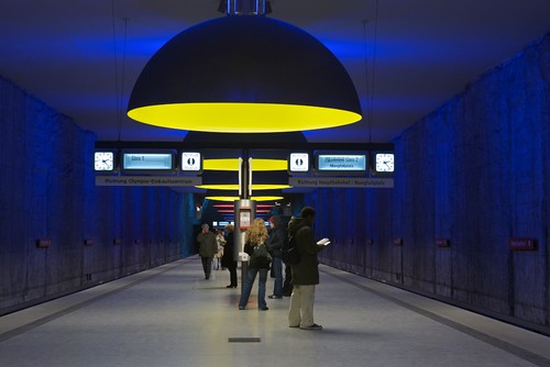
The notion that a dark ceiling will 'drop' on you is a cliche. But it's not always true. Human perception is a funny thing. I, for one, have a rather small kitchen which I painted dark blue, almost black. The effect is that it makes the space look larger rather than smaller. The trick is that dark colors can make walls and ceilings disappear, rather than coming to the foreground. But it very much depends on how it is used. Here's a nice example of the use of dark color in a German underground station. See how the walls and ceiling seem to disappear?