woensdag 28 oktober 2009

Don't put gold on top of beige


Just put new carpet in basement - which is kids playroom/hangout - Paint color is a Donald Kaufman but definately reading grey/green - I think the trim is fine, but think I need to paint the walls to warm up the room & not have the colors fighting. The carpet guy just left, so the room is not put back together at all - lots of stuff up will be put away more to move back in.
I think I need a paint that reads gold, SW Golden fleece?
Colorman says:
Please don't put gold on top of beige. My first suggestion would be to change the carpet. But since you just did that...
This room desperately needs some constrasting dark colors. The trims perhaps? And then I would balance out all the beige with some complementary hue. Here's my suggestion. (Click the picture to read the colors)

maandag 26 oktober 2009

New England-ish exterior makeover


My son & his wife just entered into contracts on this lil house in Ma - Their 1st home. They have been searching a LONG time - This is in a great area, lovely street, good schools - they have a little boy that just turned 1!  

As most 1st home buyers, they have very limited funds & will fix as they go - it needs A LOT - inside & out. I know it wouldn't take all that much on the exterior to make this house more appealing - They are getting new windows so we can change the configuration - rip out shrubs, put in steps by kit door (side), new paint.
Colorman says:
I have a bold yellow look for you. But personally I wouldn't look too far for suitable colors, so I've added a second, darker look, more or less similar to the current colors. (Click on the images to read the colors)


zaterdag 24 oktober 2009

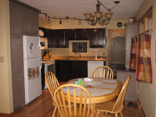
Newly done kitchen done again

 
I'm almost afraid to send pics as this is newly 'done' and I don't have the thickest of skin - but here goes... "What colors???" Backsplash is painted (fake) brick. It's still the OLD kitchen color. What color should I paint it now? Thinking a shade lighter than Ivoire. But am tempted to try a bit more *color*. But what? Or do I have enough variation going on already?
Colorman says:
Too much beige. Too much browny colors. I'd suggest going the opposite: a greenish color for the wall to create a more balanced image. Don't worry about the backsplash. Just make it light.

donderdag 22 oktober 2009

Color makes one space into two rooms


I am seriously considering painting my dining and living room a color. In the rest of my house (besides bedrooms) I am using BM Navajo White on my trim and ceilings, which is a match to my kitchen island cabinetry. Any thoughts??
Colorman says:
If see two rooms in the picture. If you paint the two in different colors, you will see two seperate rooms instead of one space.

Click the picture to read the colors.

dinsdag 20 oktober 2009

A dark color to brighten up a foyer


I've been looking at various paints trying to find something more cheerful and "enlightening" for my foyer. With the dark walnut floors and the current beige paint, it just isn't working right now - ie depressing! If you have any ideas I'd appreciate it..thanks!
Colorman says:
This may sound counter intuitive, but how about a dark color on the wall? It seems to me that your foyer has lack of contrast, rather than lack of bright color. The dark color brings contrast and makes the light colors stand out much brighter.

Click on the image to check out the color.

maandag 19 oktober 2009

Windham Cream toooooo yellow


I was hoping it would be more Cream instead it's more yellow. Is BM Rich Cream's this yellow? I almost feel like it's Easter between the blue and yellow.
Colorman says:
Never pick a single color on its own. The Windham Cream works the way it works in this very environment. So it's not the color. It's the setting. I colorjived the picture, but left the Windham Cream (in the middle) intact. I'm not saying you should paint it this way (in fact the colors I painted are pretty ugly) but do you notice how the Windham Cream has changed? Believe it or not, the Windham Cream is about the only color that hasn't changed in my image. Amazing, isn't it? In this case the effect it due to contrast of complements. Remove the contrast of complements and the yellowish effect is gone.
So go back to the paint store, but this time take a sample of the blue color to put it next to the yellow.

Click on the image to play with the colors.

zondag 18 oktober 2009

A staircase from busy to boring to lively


This is my own fault - I stripped some really busy wallpaper (the kind with the tiny flowers and shells everywhere, ugh!) and I was so determined to get rid of the busy-ness that I intentionally chose the blandest paint color I could find. But now it's so bland and boring! I have a few decorating ideas, but I'd love to hear yours also.
Colorman says:

This should spice it up a little. (Click on the picture to read the colors)